Creative Strategy Proposal
Watch this video first.
To the Consulting.com Growth & Hiring Team
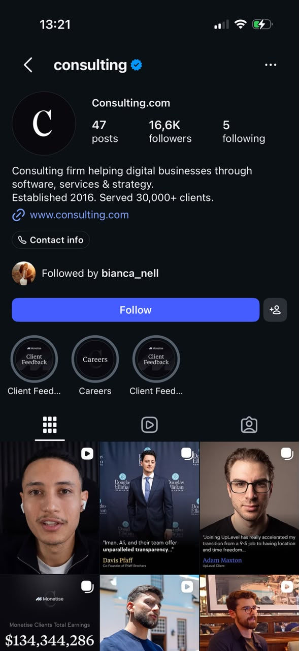
Consulting.com is already driving 250M+ monthly organic views. The problem isn’t getting attention; it’s systematically converting that traffic into high-ticket clients while maintaining absolute brand authority. Below, I’ve built targeted, performance-based creative assets specifically for your core funnels: a strategic carousel for Quantum, and two high-converting static posts for Monetize.
If the strategic depth and visual execution match the A-player standards you require for your remote team, let’s connect.


Component 1: Premium Organic Engine (Social Media Carousels)
Turning a client result into a reason to apply.
A founder can admire a $5.8M launch and keep scrolling. I created this independent concept to give that result a more useful role: opening a conversation about what could be limiting the reader’s own business.
The carousel introduces the outcome, puts a person behind it, and connects the story to the operational concerns of an established founder: profitability, team efficiency and repeatable processes. The intended shift is from “that’s impressive” to “this could be relevant to the business I’m building.”
Every design decision supports that progression, with the application introduced after the reader has context for considering Quantum.
Strategic Rationale: Why a Carousel?
A result, a testimonial, an explanation and an application request each need room to land. I chose a carousel to control their sequence while allowing the reader to move at their own pace.
The opening creates curiosity. The testimonial gives the claim a named source. The following slides introduce the operational angle and connect it to the offer. By the final slide, the reader has been given a reason to investigate further.
The commercial objective is to attract founders who recognise a relevant business challenge and want to explore whether Quantum can help. I would test alternative opening angles, revenue potential versus operational frustration, and assess the quality of the applications they generate.
Design Psychology & Visual Architecture
I built the visual hierarchy around what the reader needs to notice first. The large white revenue figure establishes the subject immediately; supporting copy gives it context. Generous spacing keeps each slide focused on a single message.
The portrait introduces a change in pace after the opening headline. It attaches the testimonial to a person and business, giving the reader something more specific to assess.
The black, charcoal and gold palette creates a restrained visual identity around Quantum. Serif typography gives names and section titles an editorial tone, while the simpler body type keeps the explanation approachable. Repeated positioning, spacing and containers make the sequence feel connected, so the reader can concentrate on the changing message.
The design gives the story structure. The strength of the evidence determines how persuasive that story can be.
Component 2: Premium Organic Engine (Social Media Static)
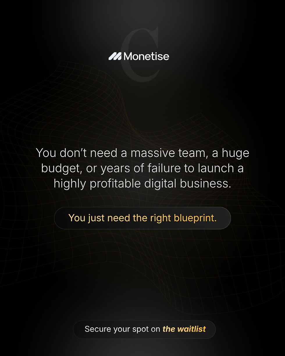
Speak to the reasons people haven’t started.
I built this concept around three concerns that can delay a decision: limited budget, a small team and fear of getting it wrong. The message positions Monetise as a source of structure for someone who wants to start but feels underprepared.
The subtle grid reinforces the idea of a blueprint, while gold draws attention to the proposed solution and waitlist. Keeping the post focused on one objection gives the reader a clear reason to reconsider what’s holding them back and explore the offer.
Component 3: Premium Organic Engine (Social Media Static)
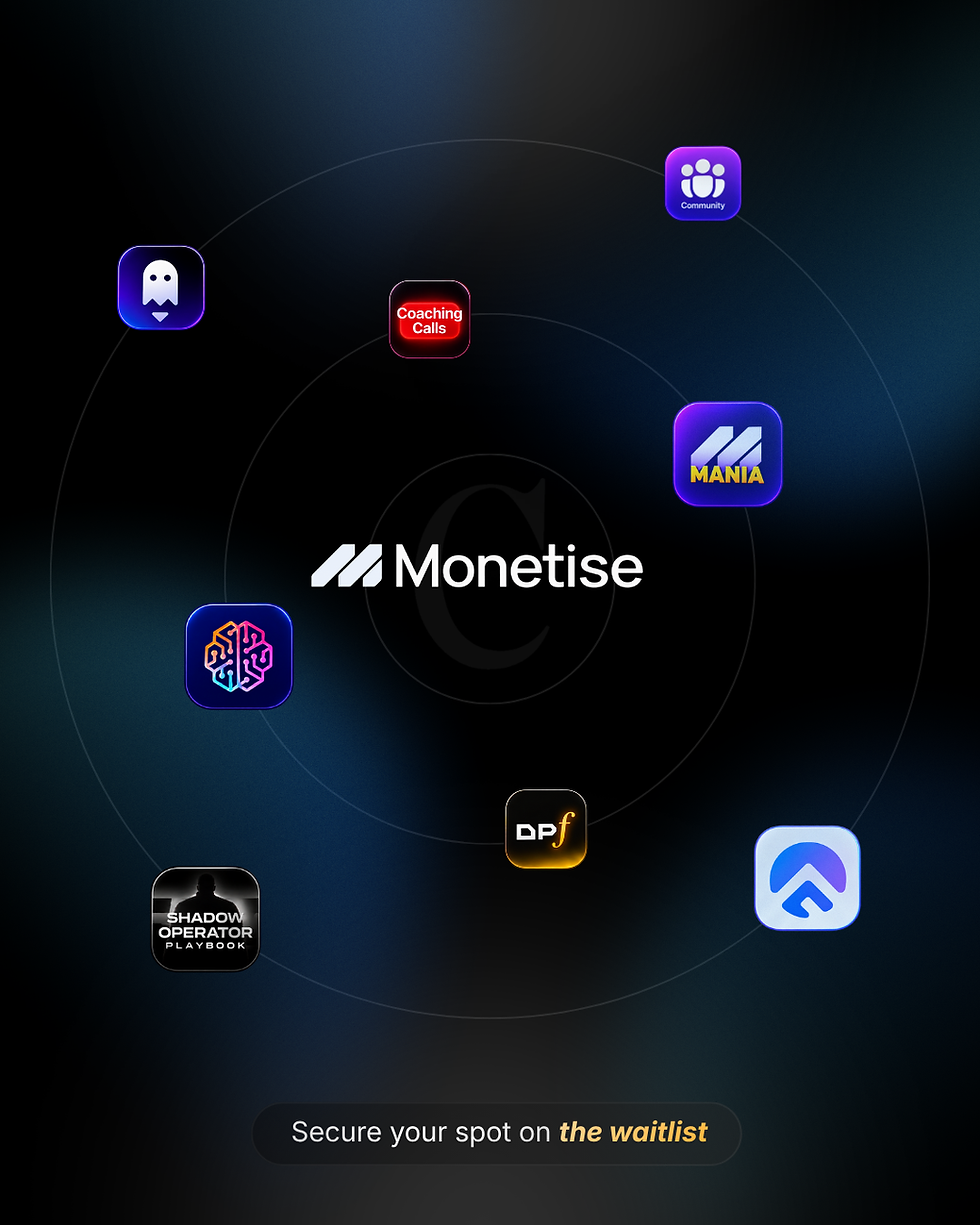
Make the value behind Monetise visible.
I designed this post to answer a practical question: “What would I get access to?” Placing Monetise at the centre, surrounded by tools, coaching and community, presents the offer as one connected experience.
The static format lets viewers take it in at a glance. A dark background gives the colourful icons contrast, while gold highlights the next step. For someone already familiar with Monetise, the aim is to turn curiosity into a reason to join the waitlist.
The Bottom Line
I built this entire proposal to prove one thing: I understand your business, your audience, and your visual language without needing a brief.
A fast-scaling digital empire brings intense speed, tight deadlines, and constant iteration. I’ve had my fair share of working under pressure, I’ve learned how to navigate it, and I absolutely thrive in it. High-stakes environments do not rattle me; they sharpen my focus.
You run a global team of 50+ A-Players, and A-Players don't need to be micro-managed. They need a clear objective, clean systems, and the autonomy to execute under pressure. I don’t want to take up your time with endless onboarding meetings or hand-holding. I want the opportunity to step into your ecosystem as your next Marketing Designer and immediately lift the creative execution off your plate.
Give me the objective, hand me your internal SOPs, and watch me turn your raw data into high-converting assets.